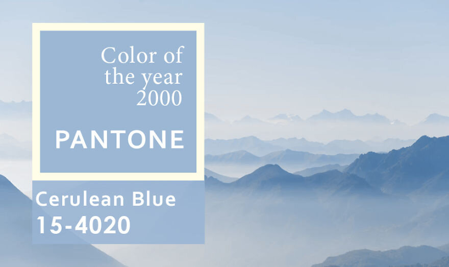
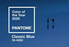
Pantone has been naming a color of the year for the past two decades. Pantone’s first pick was Cerulean Blue in year 2000. Now 20 years later Pantone has chosen Classic Blue as the color of the year. In similarity, it is a familiar, calming shade of azure. In a time of uncertainty Pantone made no mistake with this reliable, tried and true hue.
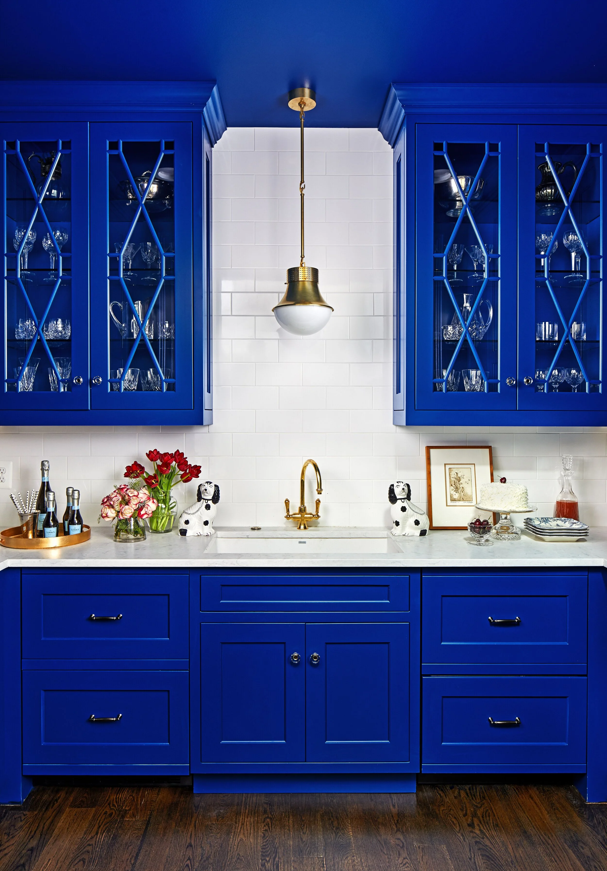
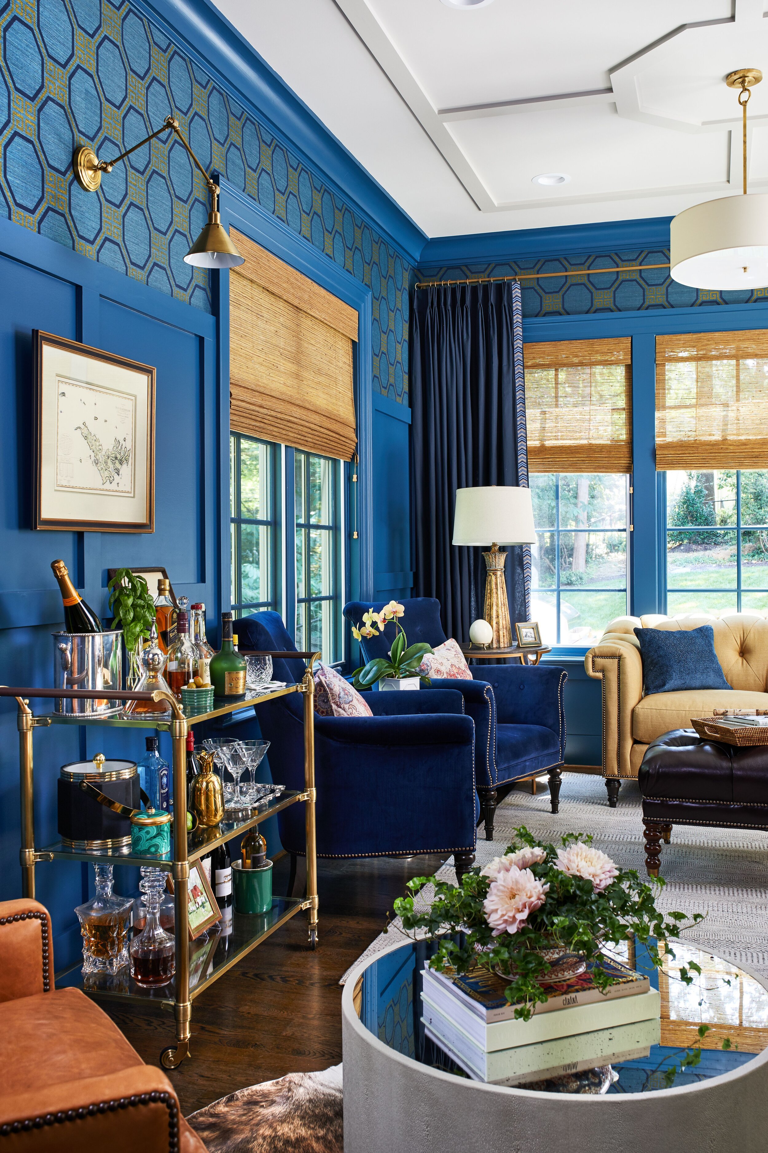
Blues have long been one of my favorite colors to use in interior design. From a psychological standpoint, blue has always represented a certain amount of calm and dependability. It is a color that can stand the test of time —which makes it a great choice for cabinetry. Below are images of a recent butler’s pantry and study we designed for a client in McLean. Who says blue is boring?

Wrapping an entire room in color —one of Veranda’s favorite rooms of the year is this dining room by Shazalynn Cavin Winfrey. What’s a better application of blue than classic and bold? Also a keen mindset for the new year.

SCW Interiors
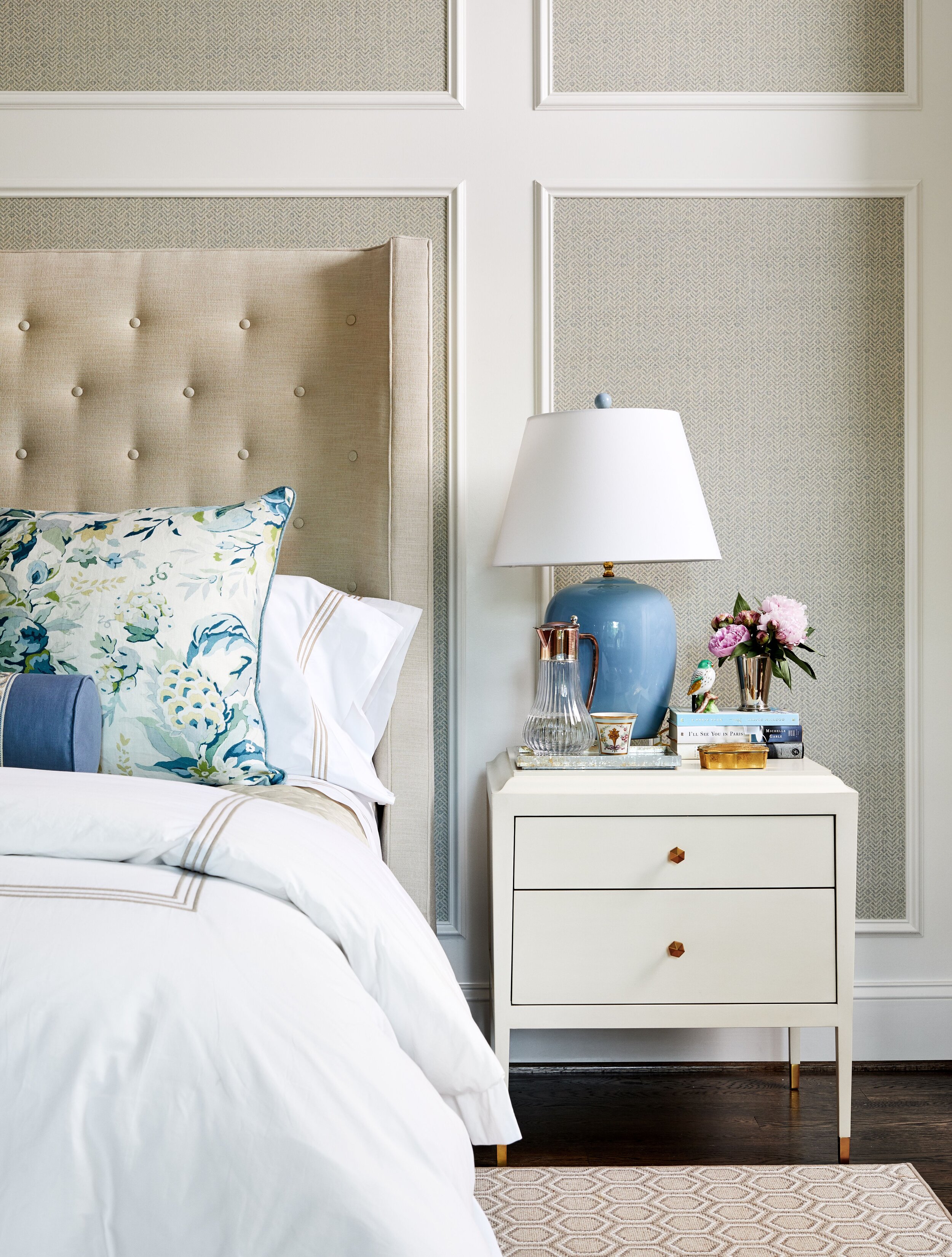
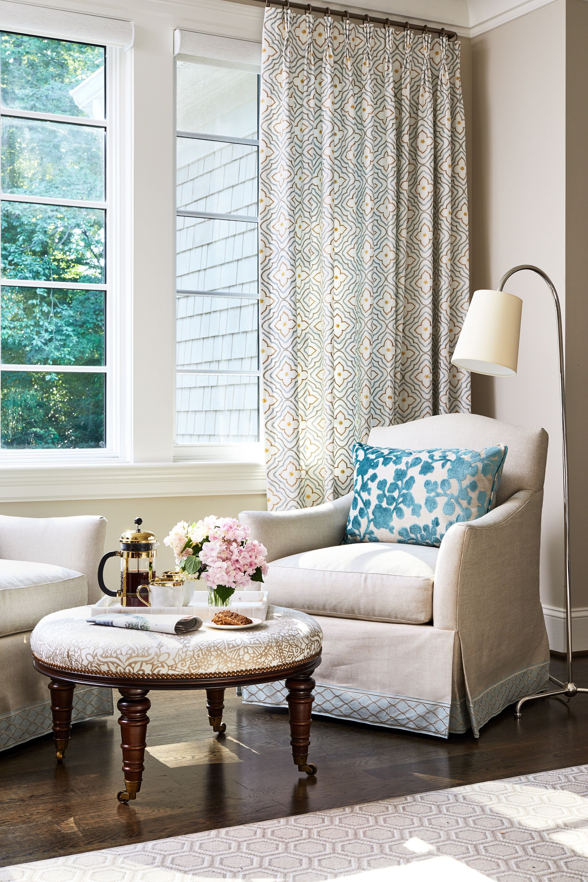
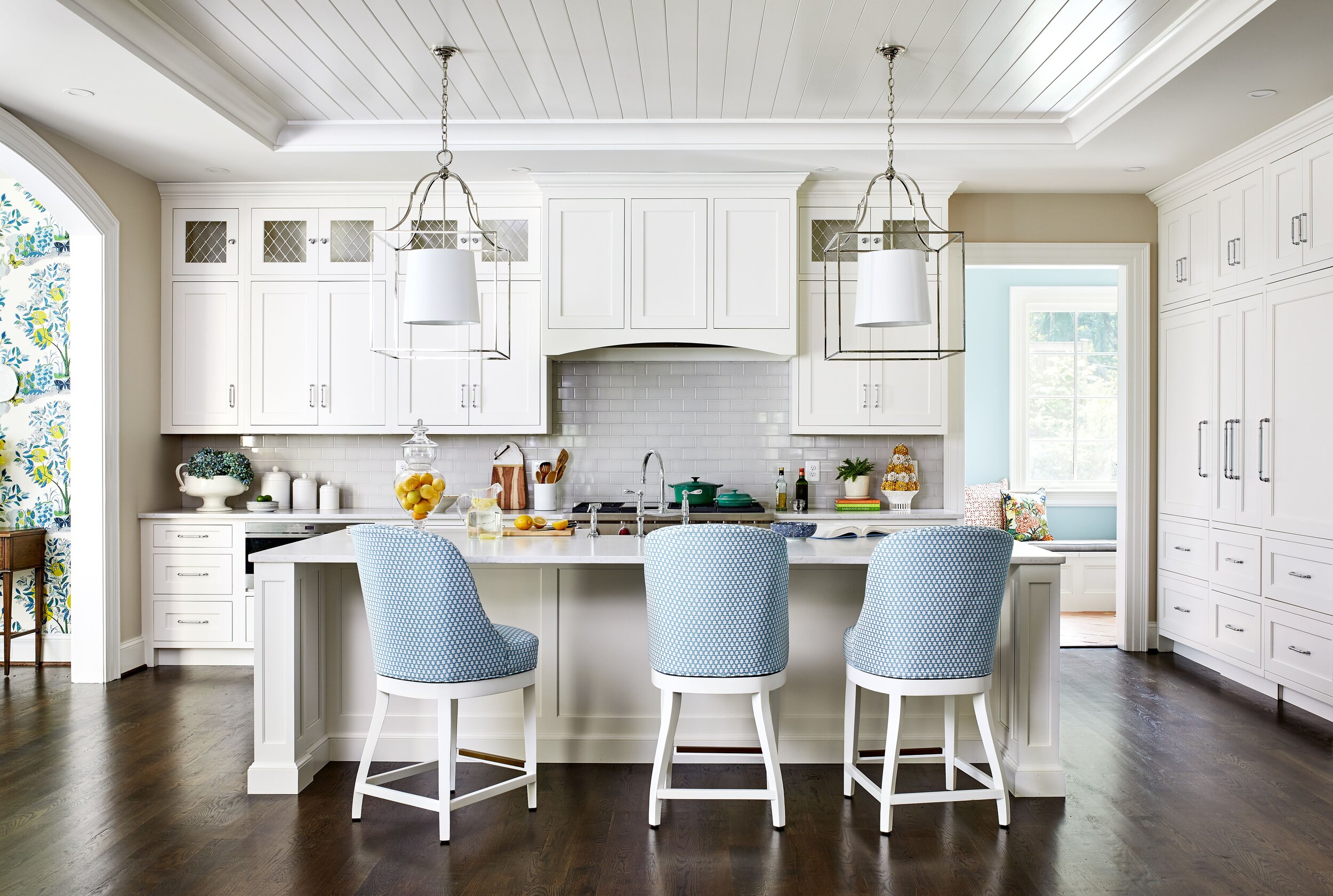
Not ready to go all in with a room saturated in blue? Adding subtle details to a neutral space can readily bring a room to life. Keep pops of color to lighting, pillows, and even barstools. These items are easily interchangeable as you want to experiment with new color trends throughout the year.