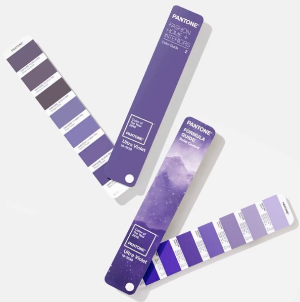
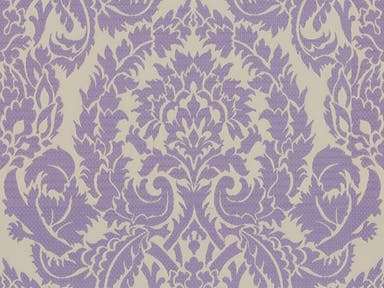
The days of peace and serenity are long gone...according to Pantone! For the second year in a row, they have challenged the design industry with another loud color. Last year it was Greenery, and following suit, the 2018 color of the year is Ultra Violet. Designers are either loving it or hating it. One of my favorite aspects of design is its diversity, so before you turn your back on this controversial hue, read on for my tips and creative ways on how to embrace the purple.
“The Pantone Color of the Year has come to mean so much more than ‘what’s trending’ in the world of design; it’s truly a reflection of what’s needed in our world today”
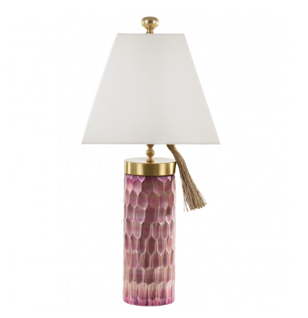
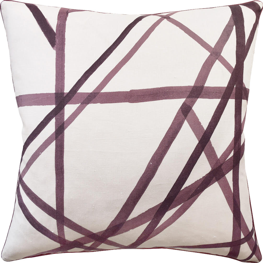
An easy way to incorporate this color into your home is with accessories. Adding purple pillows to neutral upholstery is a simple, non-committal way to punch things up. Contact us to purchase this "Modern Channel" pillow. Or relieve your FOMO with this Ro Sham Beaux table lamp.
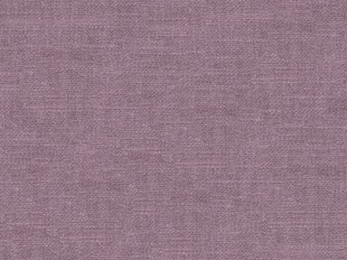
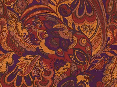
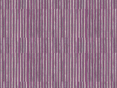
Looking for a longer lasting relationship with the Ultra Violet palate? Some of my favorite Lilian August fabrics pull off purple right. Reach out to our firm if you're looking to reupholster existing chairs, ottomans, or sofas -making for the perfect spring refresh.
You may remember my South Tampa project, where I fully embraced the purple. Our client envisioned a boutique-style Parisian influence in her bedroom -and that is what we gave her. Perhaps I had a premonition for the 2018 color of the year? In this space we complimented the pale purple walls with luxe purple bedding accents, a bold lavender chair, and a striking purple trim on the window treatments.
One of my favorite examples of "Go Big or Go Home" is interior designer Mary McGee's foyer, featured in House Beautiful. She painted the walls, ceiling, and door in a welcoming shade of lavender. The look is pulled off by very carefully adding complimenting shades of purple as seen in the lighting, bench, and artwork. It starts with picking the right hue, but when you do, big risks often yield beautiful rewards.
Cheers to embracing new colors, adventures, and goals. Happy 2018 to you and yours from our team at Pamela Harvey Interiors!
